True North Mergers & Acquisitions

TNMA is an accounting, advisory, and business services firm supporting individuals, companies, and specialized industries with financial and operational guidance. This large scale website project was delivered in collaboration with a team of designers, where I contributed to refining the visual direction, improving content clarity, and shaping a structured, user friendly digital experience across a wide range of services and pages.

Service
Website Redesign
Client
True North M&A
Timeline
6 Weeks
Tools
Figma

Business owners preparing to sell their life's work deserve more than a cluttered, jargon-heavy website. This redesign transforms tnma.com into a high-trust, conversion-focused experience , leading with empathy, guiding with clarity, and earning credibility through every scroll.

Problem

Users visiting tax and accounting websites often feel overwhelmed and uncertain. Information is dense, terminology is complex, and services are not clearly differentiated. This creates hesitation and reduces trust at the exact moment users need confidence.

The existing experience lacked clear structure, making it difficult for users to quickly understand what TNMA offers, who it serves, and why it is trustworthy. Important services were buried under heavy content, and the visual hierarchy did not guide users toward action.

The challenge was to simplify a complex service space while building immediate credibility and making decision making effortless.

Solution

We designed a clear and structured experience that simplifies complex financial services into digestible, user friendly content. The approach focused on clarity, trust, and guided navigation.

Content was reorganized into well defined sections that clearly communicate services, industries, and value. Visual hierarchy was strengthened to lead users through the page with confidence, highlighting key information at the right moments.

A refined visual system using strong typography, controlled color usage, and consistent layouts was introduced to establish professionalism and credibility.

The result is a website that feels structured, trustworthy, and easy to navigate, helping users quickly understand TNMA’s expertise and confidently take the next step.

  • The color palette uses deep blues and clean neutrals to communicate trust and professionalism, while high contrast typography improves readability and helps users easily understand complex financial information.

  • User interviews revealed that business owners weren’t looking for transactional language, they wanted to feel understood. The redesign reframes every section around the seller’s journey, not the firm’s services list.

User Research & Strategy

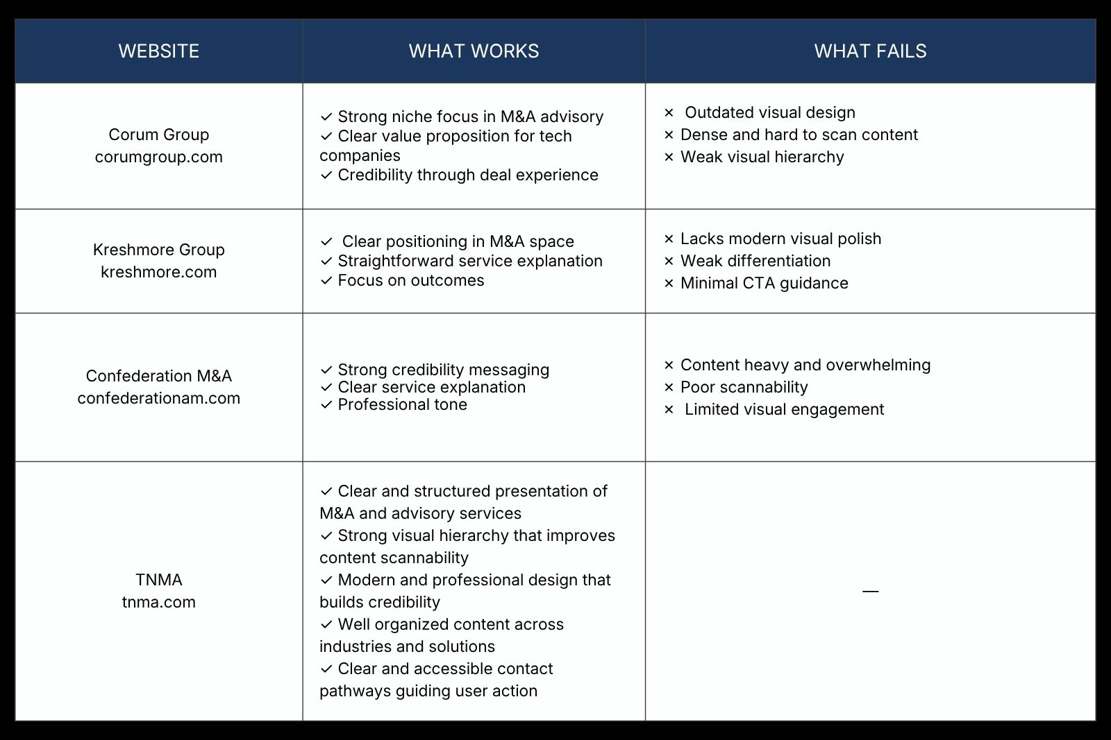
Reviewed competitor tax and accounting websites to understand how users evaluate services, identifying that users prioritize trust signals, clear service breakdowns, and a direct next step, which shaped a strategy focused on clarity, credibility, and reducing information overload.

Wireframing & Information Architecture

Worked with existing wireframes, interpreting their structure and intent to ensure the final design clearly communicates services, builds trust early, and guides users smoothly toward taking action.

Interaction & Visual Design

Designed a clean and structured interface using consistent spacing and strong typographic hierarchy to improve readability and help users quickly scan content and identify key actions.

Usability Testing & Iteration

Refined the design through team feedback and iterative improvements, simplifying content, strengthening hierarchy, and enhancing CTA visibility to create a more intuitive and user focused experience.

"Working with the team on this redesign was a great experience. The final outcome feels clear, structured, and far more aligned with how we want to present ourselves. Our services are now easy to understand, and the overall experience makes it much simpler for clients to navigate and take the next step. It’s a significant improvement from where we started."
- True North Mergers & Acquisitions

Key Outcomes

• Simplified a large scale, content heavy website into a clear, easy to navigate experience

• Strengthened trust through improved visual consistency and clearer service communication

• Improved navigation across multiple services and industries for faster user decision making

• Reduced cognitive load with stronger hierarchy and more structured content flow

• Increased visibility of key actions, making the experience more conversion focused

© 2025 Huzaika Matloob. All rights reserved