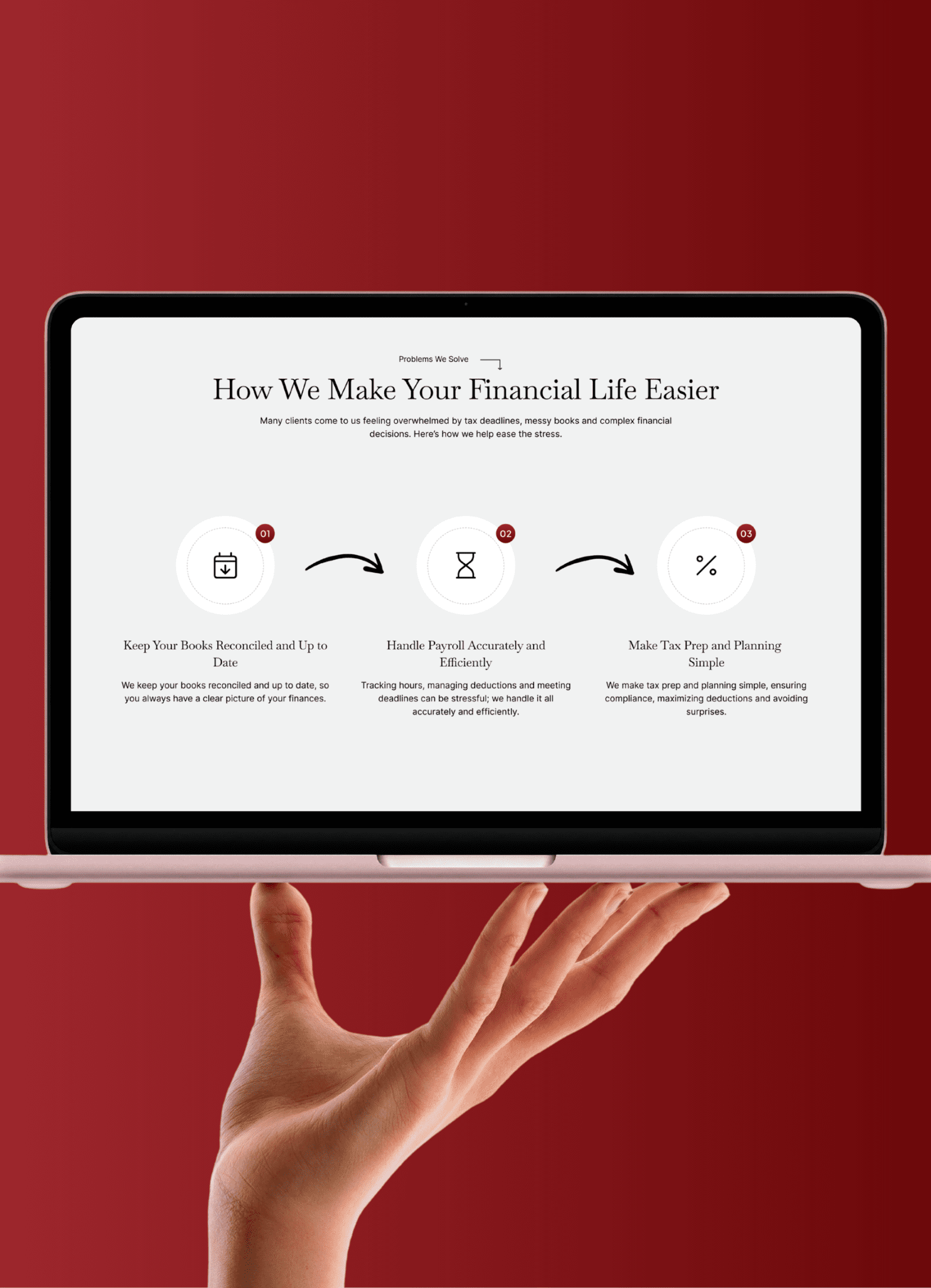
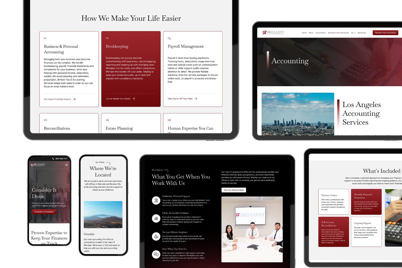
A redesign of a tax and accounting firm’s website — focused on reducing cognitive overload, building trust above the fold, and driving users toward consultation. Delivered in 2 weeks using Figma.
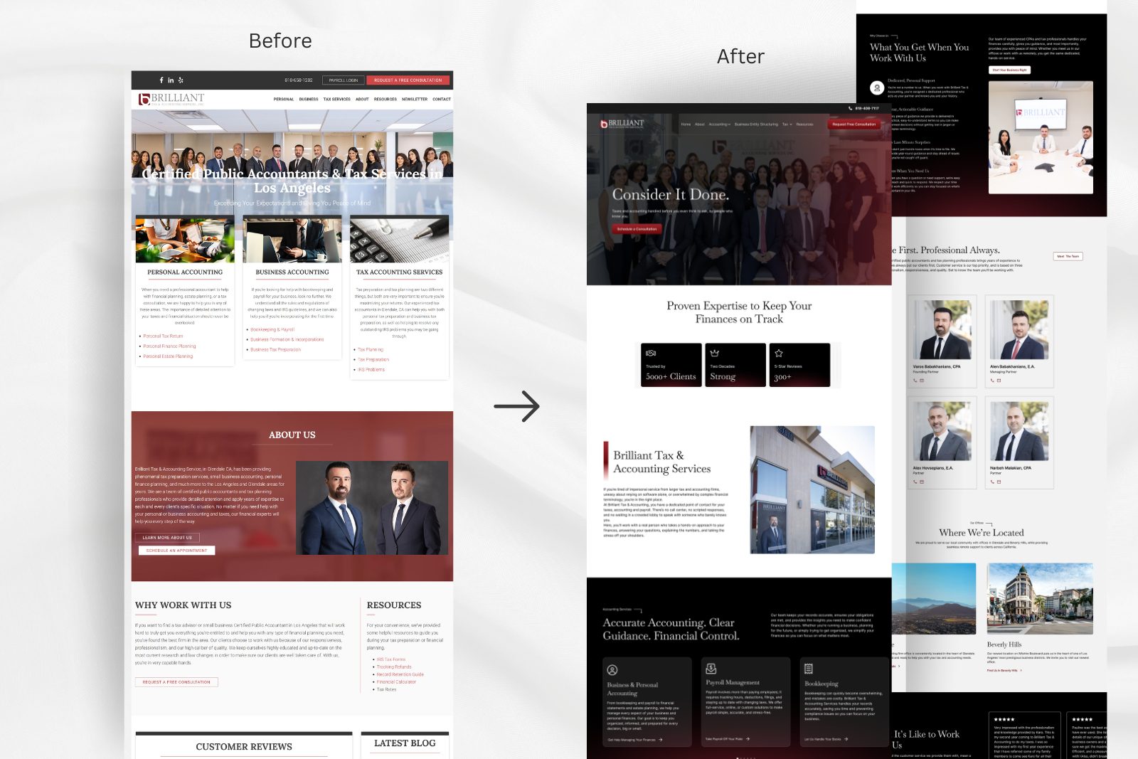
• Users couldn’t identify the right service — the site had 6+ categories with no clear hierarchy
• No visible primary CTA — consultation was buried 3 scrolls deep
• Wall-of-text layout caused high drop-off for first-time visitors
• Zero trust signals above the fold — no credentials, testimonials, or social proof
• Designed a single “Request Consultation” hero CTA with high-contrast placement
• Collapsed 6 service categories into 3 clear user-intent groups
• Reduced body copy by ~40% by deprioritizing secondary content
• Added credential badges, client count, and a professional team photo in the hero section
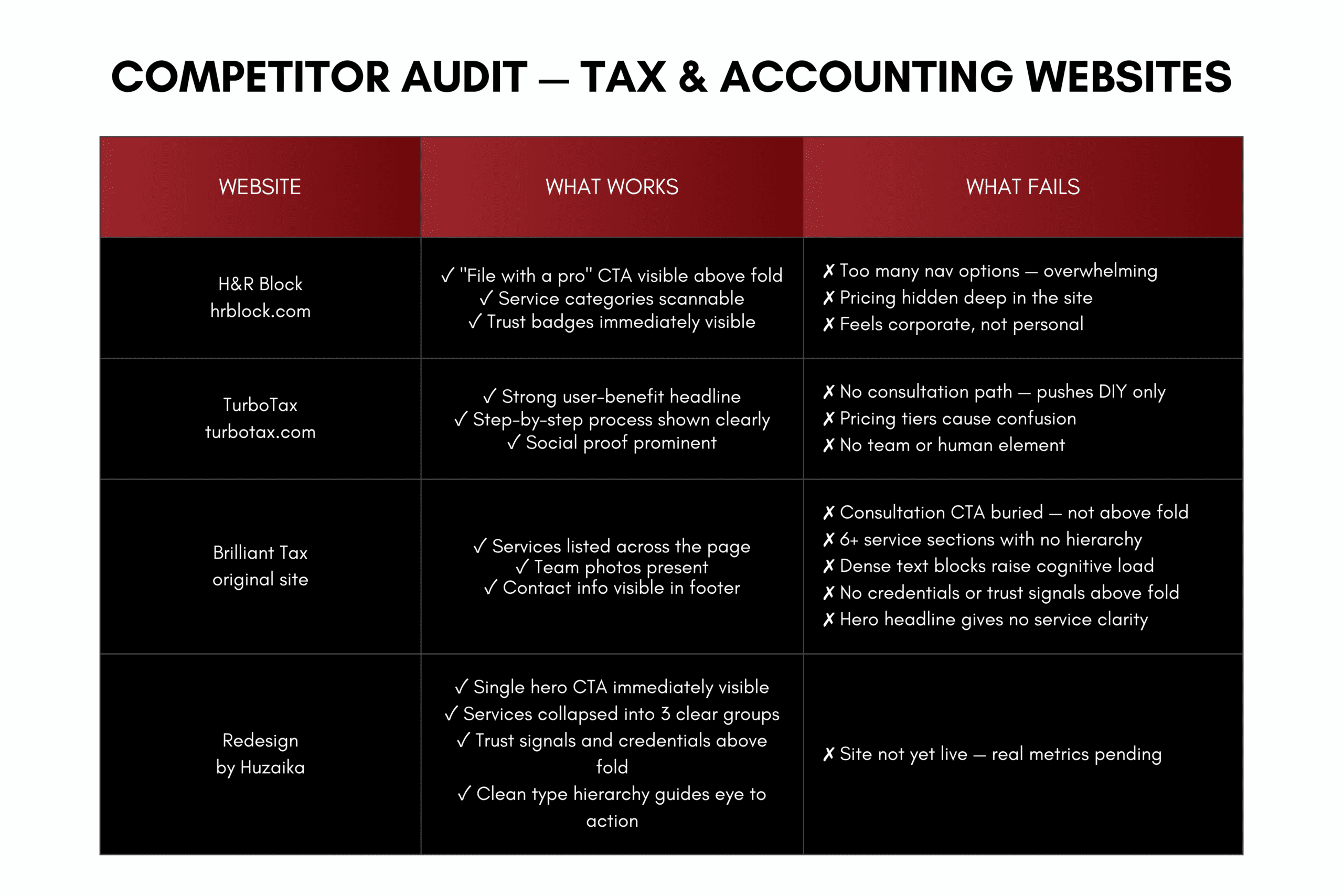
Audited 5 competitor tax websites to identify patterns in navigation failure and trust-building. Found that users scan for three things: price range, credentials, and a clear next step — none of which the original site provided.
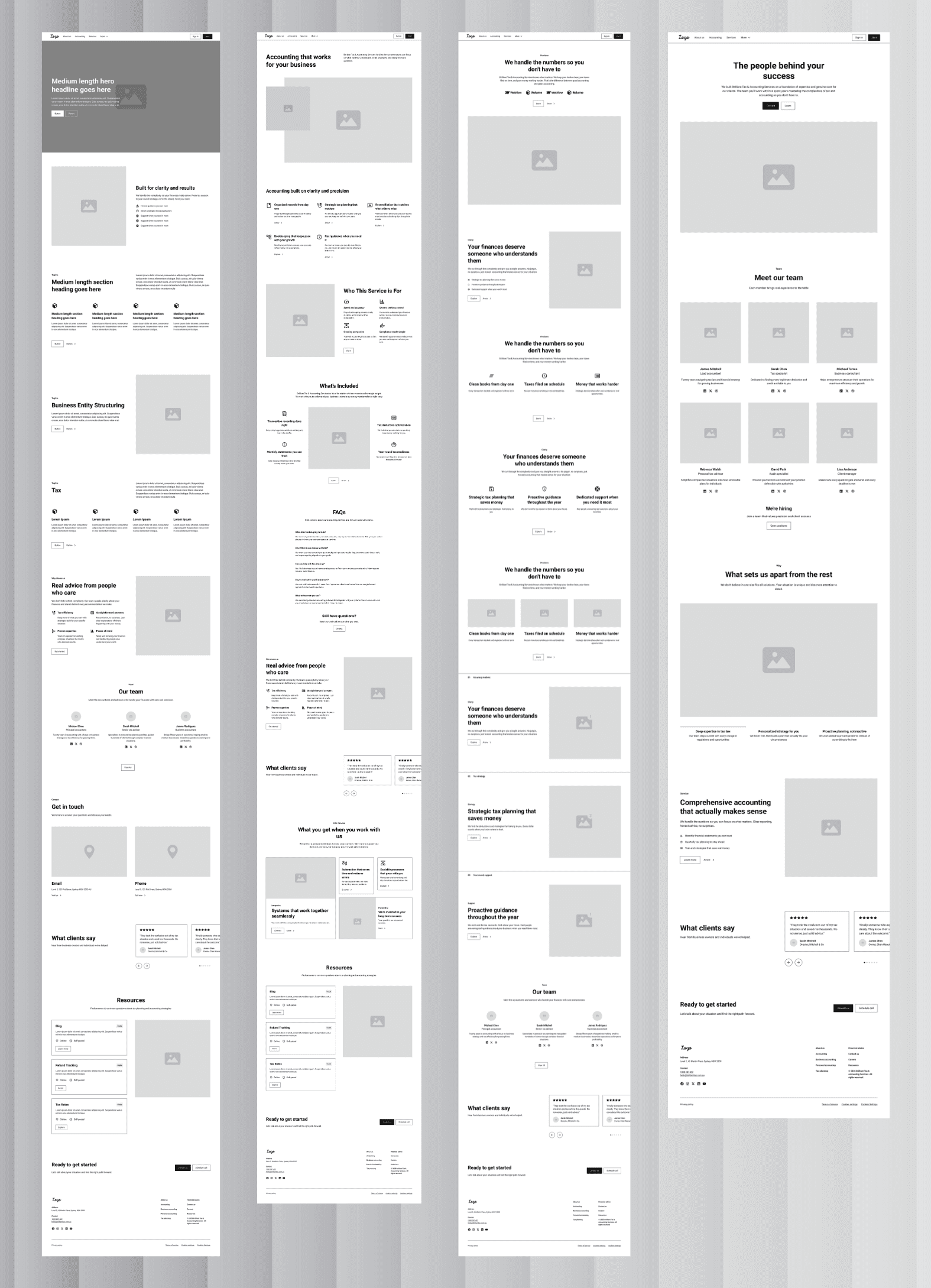
Restructured the page into 4 zones: Hero (trust + CTA), Services (simplified), Social Proof, and Contact. Moved the consultation CTA from the footer to the hero and mid-page.
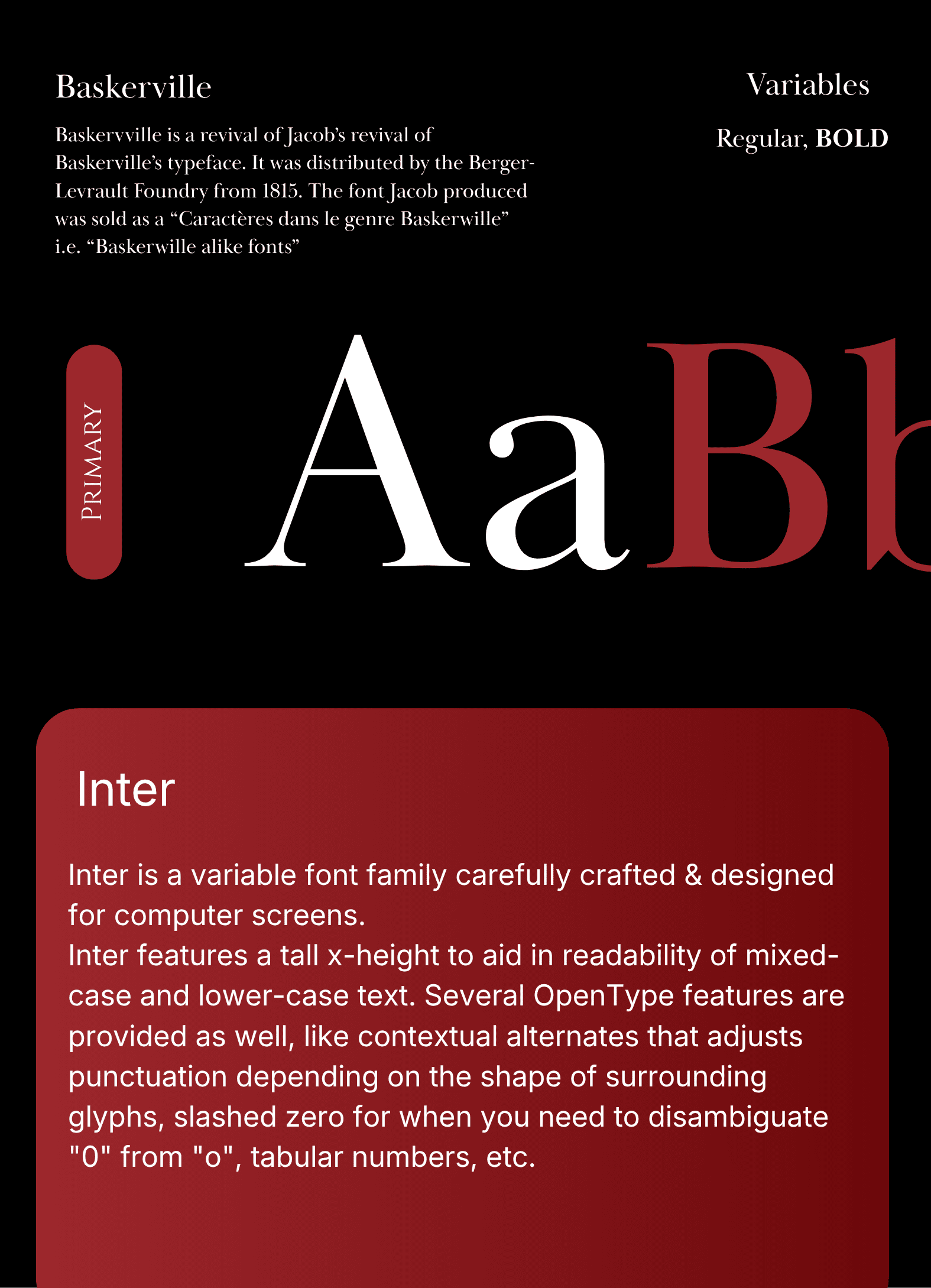
Applied an 8pt grid for consistent spacing and used a strict 3-level type hierarchy — headline, service name, CTA — designed to guide the eye to action in under 5 seconds.
Tested 2 layout versions with users from the target audience (small business owners). The simplified service grid with a sticky CTA was preferred unanimously. Adjusted heading sizes and CTA label copy based on feedback.
• Designed a clean, trust-first layout that positions a professional firm credibly to both individual and business clients
• Cluttered service list restructured into clear, scannable categories — making it easier for visitors to find what they need instantly
• Visual hierarchy built around credibility signals — certifications, professional accreditations, and trust badges placed prominently above the fold
• Consultation request flow designed from scratch with a clear CTA path, reducing friction from landing to enquiry
• Fully responsive across all devices — consistent experience from mobile to desktop